WIZLIT
A TABLET APP connectING senior ADULTS seeking social engagement with young children learning to read.
Project Overview
The Challenge
To develop an app that provides a solution for senior adults experiencing social isolation.
The Solution
A social app that matches senior adults (“Wise Friends”) with young children (“Little Friends”) and sets out to provide social engagement and bring a sense of purpose to the lives of senior adults, while also providing the opportunity for growth, development and social engagement for children.
Project Goals & Requirements
The app must be easy to use and understandable by both senior adults and young children. It should appeal universally to senior adults, young children and their decision-making parents, while also addressing the accessibility needs of senior adults, and the safety needs of children. Given the accessibility requirements and the nature of the app, the app should be designed for use on tablet devices.
Focus: The senior adult user of the app.
Design Requirements
/ Designed tablet app for the senior adult user
/ Product name, logo & branding
Role
Concept development
Research, design, branding, prototyping & testing
1/ Research
Featured: Secondary Research | Primary Research | questions to consider
Secondary Research
I began my process with secondary research to gain an understanding of the issues facing my user groups. I wanted to learn more about the impact of social isolation on senior adults, their families, as well as society as a whole; and to understand more about how the use of screen time is affecting young children as they develop.
I went on to cover research into the various impairments experienced as older adults age; accessibility requirements for senior adult users and young children; best practices for designing with child safety in mind; and technology available that can be used to meet child safety requirements.
I conduced market research to understand the strengths and weaknesses of other apps designed for children. I also looked at apps geared to senior adult users and at dating apps to see how they approach a matching process between users.
Primary Research
I conducted one-on-one interviews with participants from the three main user groups (senior adults, young children learning to read, and their parents), but focusing primarily on the senior adult users:
7 senior adults aged 70 to 89
4 parents of young children learning to read
4 children aged 4-6
Questions to Consider
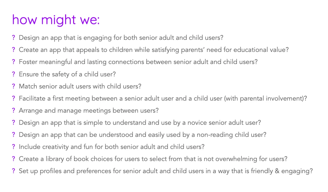
I came up with a list of How Might We questions in order to frame ideation and ensure that though my focus was going to be on the senior adult user, I was taking all users’ needs into consideration.
2/ Define
Featured: User Persona | Site Map | User Flows
User Persona
I developed the user persona Marilyn based on patterns I had identified through my user interviews. Newly living in a retirement residence, Marilyn is lonely and wants to find ways to stay socially connected with younger generations, and to feel purposeful despite her physical limitations.
Sitemap
The sitemap shows the two sections of the app based on the two primary user types of senior adults and young children. I wanted to make sure that the information architecture was straightforward and uncomplicated for a senior adult with little to no experience using technology or apps.
User Flows
I mapped out the task flow for the account setup for Marilyn and also mapped out the user flows of finding a young friend to read with, and of arranging and starting a read-date with them.
3/ Interaction Design
Featured: Low-Fidelity Sketched Wireframes
Low-Fidelity Sketched Wireframes
I took to sketching to think through and map out the layout of content, elements, and features to be included. Shown here are the home/dashboard screen, the Friends listing screen, the individual Friend profile screen, and the in-session read-date screen.
4/ User Interface Design
Featured: Brand NAME & Logo | BRAND STYLE & ui kit | Responsive UI Designs
Brand Name & Logo
The product needed a name that had meaning, but was short and fun to say, and phonetically uncomplicated for an emerging reader.
I looked to design a logo with a fun, friendly appearance that communicates connection and wisdom.
The final logo was the winner of three logo concepts that I presented to voters from the three user groups of the app: senior adults, parents of young children, and young children.
Brand Style & UI Kit
Considering the needs of both my senior adult users and young child users, the branding needed to communicate friendly and fun. It needed to appeal to young children while also being enjoyable for senior adults and respectful of varying visual, physical, or cognitive impairments. Because the glare of a bright white screen can bother some senior adult users, I chose a warm neutral tone for the background and high contrast black text for easy readability.
To appeal to senior adult users with lower comfort levels with technology and to young child users, I wanted to stay away from a more modern visual design that was too cold or clinical. I decided on an illustrated, friendly storybook visual design with a bright, retro 70s feel to the colour palette to appeal to the two generations.
Responsive UI Designs
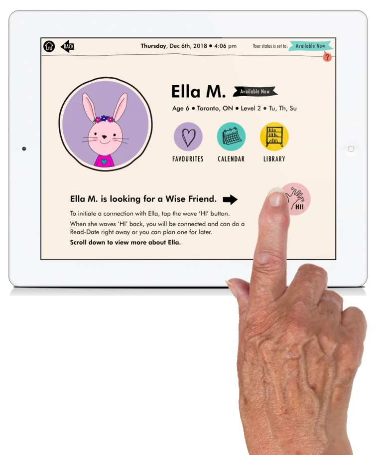
Using elements from the style tile and UI kit, I created designs for tablet devices. For child safety (and a play element and creative fun!), young child users are represented in their profiles by animal avatars that they build and colour themselves, rather than permanent real-life photographs. Senior adult users can view the favourite things of an individual Friend to get a better sense of who the child is, and can view the child during the video read-date. For child safety, screens black out if the frame moves away from either user’s face.
To account for varying accessibility needs, volume, brightness, and zoom can be adjusted in Settings or adjusted directly on the screen during a read-date video session.
LOADING SCREEN FOR SENIOR ADULT USER
DASHBOARD/HOME SCREEN
UNFILTERED LITTLE FRIENDS LISTING
FILTERED LITTLE FRIENDS LISTING
INDIVIDUAL LITTLE FRIEND’S PROFILE PAGE
INVITATION SENT FOR A READ-DATE
READ-DATE SESSION: WAITING TO CONNECT TO LITTLE FRIEND’S SCREEN
READ-DATE SESSION: BOOK READING
READ-DATE SESSION: BOOK MARKING
READ-DATE SESSION: READ ANOTHER BOOK OR END CALL
5/ Test & Iterate
Featured: Prototype | Affinity Map
Prototype
I created a prototype using Invision that includes all screens necessary for testing the task flows of taking persona Marilyn through a first experience of finding and connecting with a Little Friend, and beginning a read-date session with the Little Friend.
REFLECTION
Wizlit was my most research-intensive project yet and presented me with a huge opportunity to learn. It was fascinating (and scary!) to learn about the onset of physical impairments that occur as we age and to understand how these impairments affect how we interact with the world around us. User interviews, particularly with the senior adults, were not only informative and enlightening, but also thought-provoking, and further fuelled my desire to explore how digital products can improve the lives of senior adults, particularly by offering opportunities to keep them socially engaged despite physical or other limitations.
I found the UI design of this project more challenging than past projects because of working to create an interface that addressed the varied accessibility needs of senior adult users while still achieving an aesthetically pleasing interface that would appeal to senior adults, young children and their parents.
When time allows for it, I’d like to develop this product further.


